【CSS Grid】2カラムの横幅を自由に調整する方法
 acquiesce.inc
CSS Gridで2つの要素の横幅を自由に割り振る方法を紹介します。
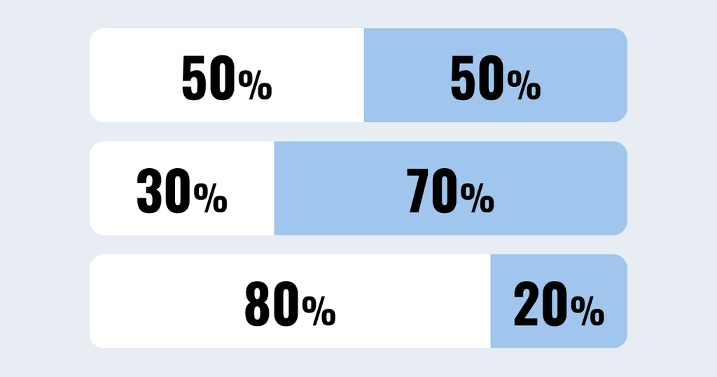
grid-template-columns を使えば、5:5、6:4、8:2といった比率を簡単に指定できます。
- 5:5で均等割
- 8:2で2カラムのブログ
- 6:4で写真とテキストのブロック
などWeb製作でよく使うブロックを簡単に実装できます。
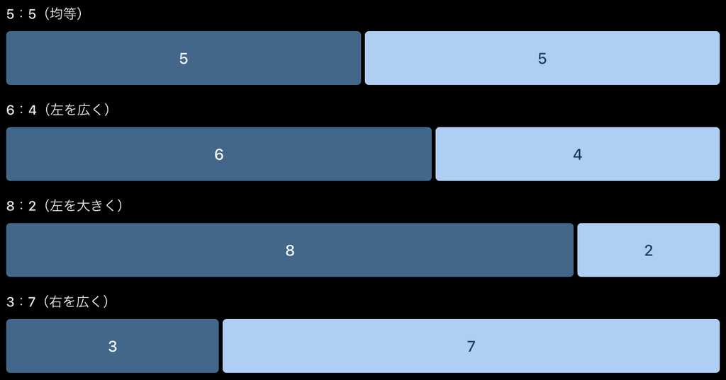
横幅の比率サンプル
サンプルコード
サンプルHTML
<div class="grid-ratio ratio-5-5">
    <div class="grid-item">コンテンツ01</div>
    <div class="grid-item">コンテンツ02</div>
</div>
grid-ratio ratio-5-5
ratio-5-5のクラス名を以下に変更すれば比率が変わります。
- 5:5の比率 クラス名【 ratio-5-5 】
- 6:4の比率 クラス名【 ratio-6-4 】
- 8:2の比率 クラス名【 ratio-8-2 】
- 3:7の比率 クラス名【 ratio-3-7 】
コピペで使えるCSSサンプル
/* 共通設定 */
.grid-ratio {
    display: grid;
    gap: 20px; /* ブロック間の余白 */
}

.grid-item {
    min-width: 0;
    background-color: #f5f7f9;
    padding: 20px;
}

/* 5:5 */
.ratio-5-5 {
    grid-template-columns: 5fr 5fr;
}

/* 6:4 */
.ratio-6-4 {
    grid-template-columns: 6fr 4fr;
}

/* 8:2 */
.ratio-8-2 {
    grid-template-columns: 8fr 2fr;
}

/* 3:7 */
.ratio-3-7 {
    grid-template-columns: 3fr 7fr;
}

/* スマートフォンでは1列表示 */
@media (max-width: 767px) {
    .grid-ratio {
        grid-template-columns: minmax(0, 1fr);
    }
}
Web制作での実装例
実際のWeb制作で使用頻度の多いレイアウト例
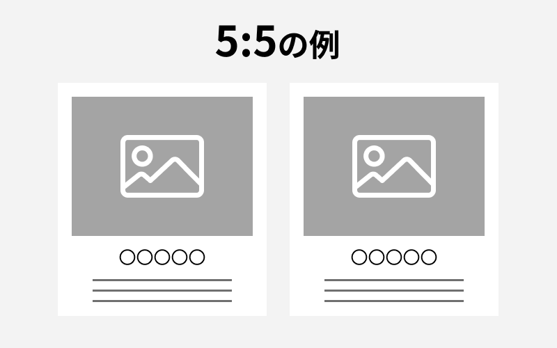
均等割のブロック
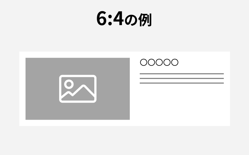
写真(大きめ)+テキスト
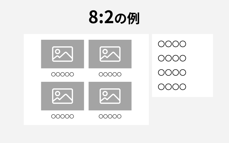
ブログサイト
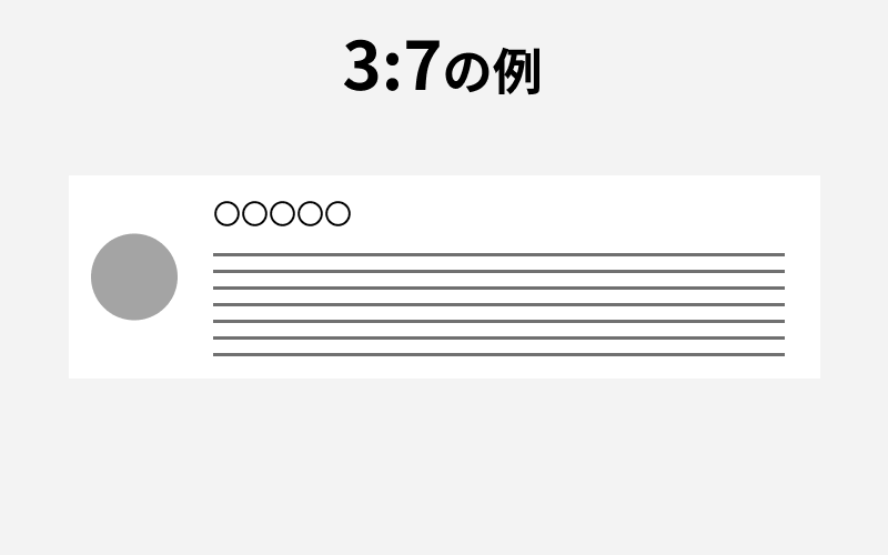
スタッフ紹介
CSS解説
grid-template-columns とは?
CSS Gridで横に並べる要素の列数や横幅を指定するプロパティです。
2つの要素を横並びにする場合 frと組み合わせて指定します。
fr とは?
fr は、CSS Gridで使える幅の単位で、利用可能なスペースをどの割合で分けるかを指定する。
grid-template-columns: 6fr 4fr;であれば、余白を除いた横幅を10等分し、左に6、右に4を割り当てる。
| 幅指定 | 左側のサイズ | 右側のサイズ |
|---|---|---|
| 1fr 1fr | 50% | 50% |
| 5fr 5fr | 50% | 50% |
| 6fr 4fr | 60% | 40% |
| 8fr 2fr | 80% | 20% |
| 3fr 7fr | 30% | 70% |
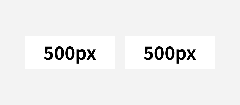
pxでの指定も可能
.grid-ratio {
    display: grid;
    grid-template-columns: 500px 500px;
    gap: 20px;
}
.grid-ratio {
    display: grid;
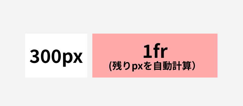
    grid-template-columns: 300px minmax(0, 1fr);
    gap: 20px;
}